To make an assessment whether the benefits of a policy outweigh the costs, we need to know both, or at least, we should be able to make an educated guess. When I started this research, I was prepared to argue why I think lockdowns are morally wrong and probably not cost-efficient despite their supposedly unquestionable epidemiological benefits. I believed they contributed to slowing the spread of SARS-CoV-2 as it was reported unanimously in the media. I’m mentioning my thought process here to be open about my bias. My personal opposition to lockdown measures, and especially to stay-at-home orders certainly influences the way I look at the evidence. But as I mentioned, I still expected to find something else. I’m baffled how most people seem to think that the science is settled in favour of strict lockdowns, because the evidence in their favor is meagre. It is not clearly visible from the data that stay-at-home orders slowed the spread of SARS-CoV-2.
Slowing the spread?
Hold on a second. I think before proceeding, we should take a moment to reflect why “slowing the spread” has become an end to justify almost any means. Slowing doesn’t mean stopping. We’re just postponing the inevitable. The only rational justification for emergency measures to “slow the spread” was the fear of a collapsing health system. There was no talk of “Zero Covid” in March 2020, there was no sports-like global competition which country had the lowest case numbers, and there were no arbitrary thresholds like “not more than 50 per 100,000 new infections over 7 days”. It was not clear whether effective vaccines could be developed and no one could foresee that 2 years later, we’re dealing with a much milder variant. The single reason large parts of the public pushed for lockdowns to “flatten the curve” was the perspective of overwhelmed hospitals.
With hindsight we can say that, luckily, the horror scenario with people dying from untreated injuries did not materialize almost everywhere. Of course, health workers have worked under extreme pressure last year, but they have done so before. Locally, ICU capacities were overwhelmed, e.g. in parts of Northern Italy. Also, in India and some South American countries, health systems really seemed to be at the brink of collapse for a few days, but remember that already before the pandemic, many people have died from completely preventable causes in these countries. Meanwhile some of the most restrictive governments have utterly failed to increase hospital capacities in the past 2 years and places like Germany or France even decided to fire nurses who don’t want to get vaccinated, irrespective of their actual immunity status. No wonder conspiracy theories are gaining popularity when governments try to prevent hospitals from overloading by firing nurses.
Flattening the curve?
If lockdowns had a strong effect, you would assume that it is immediately visible in the statistics. Therefore “flatten the curve” has quickly become synonymous with “slow the spread”. Without extraordinary measures, it was assumed by many in spring 2020, that the virus would spread exponentially until herd immunity is reached. This prognosis has clearly proved wrong. Irrespective of policies, infection curves peaked everywhere long before herd immunity was reached. Philippe Lemoine shows this brilliantly in his text “The Case against lockdowns”. Lemoine features comparisons between different European countries and US states. States like Florida, North Dakota, South Dakota, or Georgia arguably give a better counterfactual than e.g. Sweden as restrictions in these US states have been probably even laxer while other US states had strict lockdown policies. To cite Lemoine:
“Even if someone has been able to find a large effect of non-pharmaceutical interventions on transmission with a more sophisticated statistical analysis, the fact it doesn’t jump at you when you look at this kind of simple graphs should make you sceptical of that finding and, the larger the effect, the more sceptical you should be, because if non-pharmaceutical interventions really had a very large effect it should be easy to see it without fancy statistics. I think that, in general, one should be very suspicious of any claim based on sophisticated statistical analysis that can’t already be made plausible just by visualizing the data in a straightforward way. (To be clear, this doesn’t mean that you should be very confident the effect is real if you can, which in many cases you shouldn’t.) That’s because sophisticated statistical techniques always rest on pretty strong assumptions that were not derived from the data and you should usually be more confident in what you can see in the data without any complicated statistical analysis than in the truth of those assumptions. So visualizing the data provides a good reality check against fancy statistical analysis.”
I will review the literature that uses fancy statistical analysis further below. First I will present some simple visualization to give a broad picture of how bad different European countries were hit by the pandemic. But how we can even measure the “performance” of different countries? In the spring of 2020, news websites were quick to include graphs and tables on their frontpages that made a global pandemic look like a sports competition. Yet, case numbers are not easily comparable between countries. While some countries rolled out massive asymptomatic testing campaigns, e.g. testing all school students several times a week, other countries tested mainly those who showed symptoms. I have seen with my own eyes how hugely different testing regimes are: In Berlin, free test centres popped up at second corner and a negative test is required in schools, for all sorts of activities and depending on vaccination status even at the workplace. Also, self-tests are widely available and cheap. At the same time in Sweden, getting tested without symptoms costed around 30 Euro and self tests have long not been available and now sell at around 3 times the price as they do in Germany. Aside from enormous differences in test regimes, case numbers have another major drawback: They make no difference between individuals along their risk profile. A high incidence among children and a low incidence among old people would put an infinitely lower strain on the health system than a low incidence among children and a high incidence among old people. The actual infection fatality rate of a SARS-CoV-2 infection is certainly different in different countries, depending on factors such as the age distribution of the population or obesity rates. Yet, the differences reported in case fatality rate are probably much higher than that, due to underreporting or overreporting of cases. According to the data from Our World in Data, on 30 June 2021, the number of Covid-19 deaths per million divided by the number of Covid-19 cases per million varied drastically between European countries, with the lowest case fatality rates around 0.5 % (Iceland, Cyprus, Norway) and the highest case fatality rates around 4.5% (Bosnia and Herzegovina, Bulgaria). If we just take the first wave, the difference is even much larger with rates between around 0.5% (Iceland and Belarus) and almost 16% in Belgium, followed by France, Italy, the UK and Hungary with over 14% each. As infections in the first wave went down far below herd immunity was reached, larger differences between countries are not entirely implausible. It may well be that in some countries predominantly younger population cohorts were infected while in others older persons were affected. But it’s probably a safe guess that measurement error accounts for a large part of the difference.
Death statistics
Deaths are arguably a better measurement for the real burden of the pandemic as they never go unnoticed. There is no such thing as asymptomatic death. But statistics on Covid-19 deaths are not perfectly comparable across countries either. The data I use here is from Our World in Data who take the data from Johns Hopkins University. As it says on Our World in Data’s website “countries are asked to follow the ‘cause of death’ classifications from the WHO’s International Classification of Diseases guidelines. However, countries also typically provide their own guidance to practitioners on how and when COVID-19 deaths should be recorded.” Actual death figures are likely to be higher than confirmed deaths because “what we know is the number of confirmed deaths due to COVID-19 to date. Limited testing and challenges in the attribution of the cause of death means that the number of confirmed deaths may not be an accurate count of the actual number of deaths from COVID-19.”. Yet, Covid-19 deaths might be overreported, too. Limited testing was a challenge in the first weeks of the pandemic and still is in poorer countries, but in countries like Germany, there is hardly any limit to testing. Instead, locally, every person who tested positively and dies in a certain time after the test is classified as a death related to Covid-19. This German article explains how the statistics on Covid deaths are composed in Germany, for instance. The German Robert-Koch-Institut (RKI) doesn’t follow the WHO’s guidelines, but counts deaths “in relation to Covid-19”. Local health authorities report deaths to the RKI and are asked to group cases into the categories “died because of the disease”, “died because of something else”, “not able to tell”, and “cause of death not reported (yet)” (own translation). In any of these cases, the case feeds into the total death count. Local authorities are asked to use the category “died because of something else” for cases in which Covid-19 was not the main cause of death, but contributed to death. However, some authorities reported having included everyone who died after a positive test, even after recovery. In Hamburg, for some months until October 2020, every death with a positive Covid test was autopsied. In 15 percent of cases, Covid-19 did not play an important role. Some argue that differentiating between those who died of Covid and those who died with Covid only changes the numbers mildly. But to make a proper comparison of Covid death tolls in different countries, we would need to know about every country’s reporting guidelines and their actual implementations.
All-cause mortality is an easier measure to compare countries as it doesn’t depend on different local practices on reporting cases and deaths. Even in the poorer countries of Europe, institutions are generally well-developed enough to account for birth and death. Excess mortality means the number of people who actually died in a country in a given time minus the number of people that would have been expected to die in the same time, based on factors such as prior mortality rates and the population’s age structure. Focussing on excess mortality is also more useful for policy making for another reason: If Covid-19 policies cause additional deaths due to other causes (e.g. due to cancelled cancer screening), this effect is included in excess mortality statistics. Of course, this only holds for short-term secondary effects. This strength of mortality statistics is their weakness, too. They tell us nothing about the causes of death and many different effects of the pandemic and government interventions can equal each other out.
Plotting total Covid-19 deaths per million against cumulative excess mortality over the entire pandemic indeed shows a good correlation between both. If we take Covid-19 deaths at face value, this clearly shows that the virus caused more deaths than would have been expected without the pandemic. On the other hand, it is to be expected that the absolute number of deaths per million correlates with the number of Covid deaths per million even if there was no causality. Data on excess mortality is provided at the end of the month for some countries, and at the end of the week for others. For the following, I grouped data on the cumulative excess mortality from 30 June 2021 for 12 countries and 27 June 2021 for 30 countries. Cumulative excess mortality is defined here as the “percentage difference between the cumulative number of deaths since 1 January 2020 and the cumulative projected deaths for the same period based on previous years.”
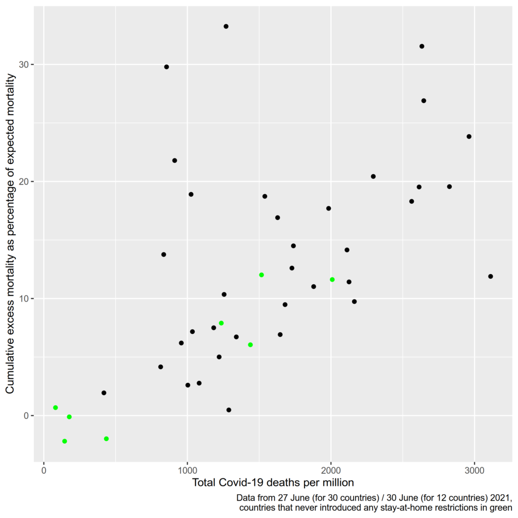
I highlighted the data points of countries that never introduced mandatory stay-at-home restrictions. Interestingly, all countries without stay-at-home orders had a below-average excess mortality. The only country highlighted in green that had above-average Covid deaths was Croatia, which implemented the strictest restrictions on movement of all these countries. The other green countries are Denmark, Finland, Iceland, Liechtenstein, Norway, Sweden, and Switzerland. Of course, this can’t be simply interpreted in the way that stay-at-home order are causing more deaths: On a list of European countries by GDP per capita, all these countries (except for Croatia) rank in the top 10. Unfortunately, one country that never implemented stay-at-home restrictions is missing in this plot: Belarus, which has had arguably the laxest Covid restrictions in all of Europe. The latest data on cumulative excess mortality reported from Belarus was 20 percent on 31 March, with 238 deaths per million. This would make Belarus one of the places with the highest excess mortality, but with the lowest numbers of death due to Covid-19. Thus there is good reason for doubts regarding the accuracy of this data. The available data suggests that there was an underreporting of Covid deaths in Belarus. There are some other countries for which the data suggests this might be the case, i.e. the countries represented by the dots in the upper left of the shown chart. The most notable outliers are Kosovo and Albania. Russia is also an outlier with an excess mortality of 22 percent, but less than 1000 Covid deaths per million.
I think this plot can provide some insights despite its limitations: There is at least no obvious connection between lockdown stringency and a lower death toll. But countries with stricter and less strict restrictions are not scattered randomly over the map. All Nordic countries, and most countries with the highest GDPs are represented by the green dots in the plot. Still, their performance proves that at least for some countries, it was not necessary to introduce stay-at-home orders to prevent a catastrophe. The logical other side of the coin is that all the countries that did have a relatively high excess mortality did introduce stay-at-home orders (except for Belarus). At the end of June 2021, of the countries for which recent data was available, the highest excess mortality was found in Kosovo, North Macedonia, and Albania – all countries with tough restrictions. Of course it cannot be ruled out that their excess mortality would have been even higher without stay-at-home restrictions.
Another insight from this graph is that over one year into the pandemic, after all big infection waves except for the most recent low-mortality Omicron wave, no country experienced a truly catastrophic excess mortality. Of course this is my personal interpretation and you are free to define “catastrophic” differently. I don’t know how much mortality rates use to fluctuate and I wouldn’t be surprised if 2020 and 2021 were indeed particularly nasty years on a longer time scale But even in the countries that suffered the highest excess mortality in Europe, the number of deaths was only one third higher than it would have been in a normal 1.5 years. Not 3 times higher, but 1.3 times higher. We’re in a pandemic after all. The true outliers are Denmark, Norway, and Finland, where less people died than what would have been expected before the pandemic
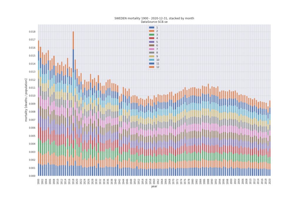
Sweden in particular has often been used to prove there were no viable alternative to lockdowns even though Sweden had one of the lowest excess mortality figures, at 6,05 percent as of end June 2021. Yet Sweden was often made look terrible by comparing it to its neighbouring countries. You can make any country’s numbers look bad by comparing them to Denmark, Finland, and Norway. While Sweden had suffered some excess mortality in 2020, it was far from being catastrophic. Total mortality per capita in Sweden was indeed higher in 2020 than it was in the six years before, but it was lower than in any year until 2013. No one said Sweden sacrificed their old people in 2013. Below graphic is taken from this blog post that wonderfully puts Sweden’s Covid statistics into perspective.
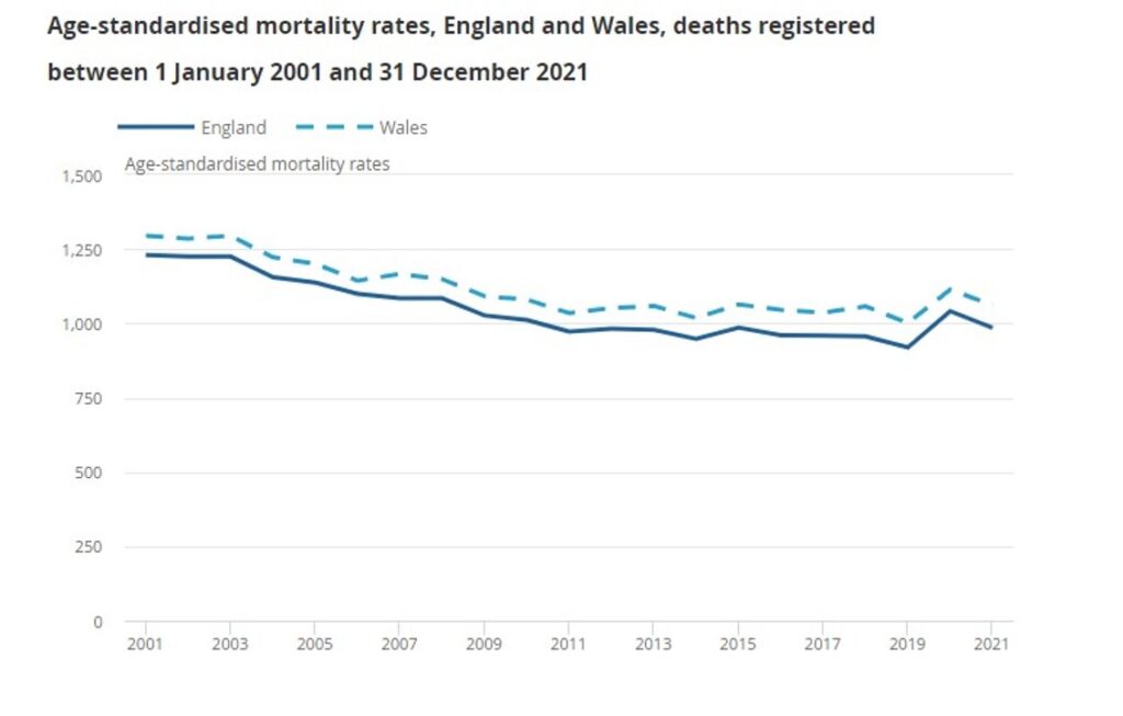
Even where excess mortality was higher, it was often not extraordinarily high by historic standards. In England and Wales, 2020 had the highest age-adjusted mortality rate since 2008 and 2021 was the most deadly year since 2015 (and 2020 obviously) as the Daily Sceptic reports based on official statistics:
But back to flattening our curves. We have seen that Covid deaths correlate quite well with overall excess mortality, so analysing deaths statistics shouldn’t be completely futile. For an explanation of my categorization of countries, please refer to the data summary. The code for all plots can be found here in my GitHub repository. Note that countries only change their category once in my model, thus the data tells us nothing about the timing of stay-at-home restrictions. I pooled all deaths for the respective country categories and divided them by the population of these countries.
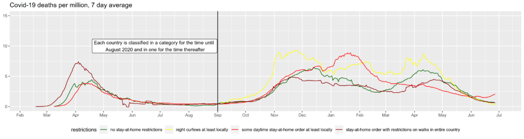
As a robustness check, I recreated the graph excluding Russia This is because Russia is Europe’s most populous country and thus has a big influence on the summarized data. As explained above, Russia has a suspiciously low Covid death count for the relatively high excess mortality it suffered. There can be different reasons for this, but one possible explanation would be that some Covid-related deaths are not counted as such. We see that excluding Russia notably shifts the curve for its category upwards, due to the low reported Covid deaths per million in Russia.
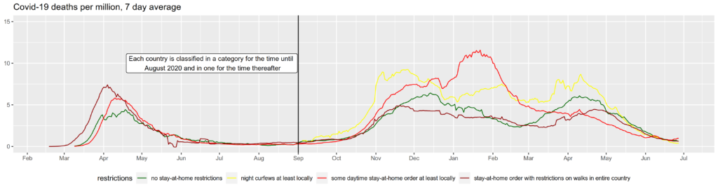
As another robustness check, I took Poland from the curfew category to the countries which have not imposed stay-at-home restrictions after the first wave. This classification might be more appropriate as Poland only had a curfew for one night (New Year’s eve). Note how the lines of both categories shift visibly during April of 2021 when a relatively large number of Poles died with Covid-19.
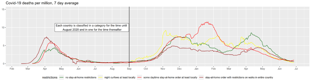
The differences between these three graphs should make clear how changing the categorization of a single country can possibly change conclusions you get from such a graph. Giving every country its own line would yield a “spaghetti plot” where it’s impossible to see anything. You can create such plots easily yourself at websites such as Our World in Data. What can be seen from the aggregations however, and also holds by plotting countries individually, is that no country has seen sustained exponential growth of cases until herd immunity was reached. This is the same for other regions. An early academic paper that noted the fact that infections with SARS-CoV-2 dropped everywhere and the reproduction number Rt fell to 1 or below everywhere independent of local restriction is Atkeson et al. (2020) and it is also showcased in Lemoine’s “Case against Lockdowns“.
Hospitalizations
Exponential growth was projected to lead to a collapse of hospitals. Maybe the most interesting statistic to measure the effects of lockdown policies is the number of hospital patients and ICU patients at a given time. Unfortunately, this data is only available for 29 European countries for hospital patients and for 24 for ICU patients. But this data is not completely straight-forward to interpret either:
First, the same problem occurs as for deaths. At least in some countries (see here for England), the figure includes everybody who is hospitalized with a positive Covid test, even if Covid is not the cause of hospitalization. Second, there is an upper limit to the number of hospital and ICU patients, which is exactly what justifies lockdowns in the eyes of their proponents. If hospitals are full and cannot accept more patients, the cases that require hospitalization but don’t receive it could not be seen in the statistic. Luckily, this scenario was very rare and to the best of my knowledge, no entire country had hospitals and ICUs running above full capacity and had to turn away patients in acute need. Regionally, this might have been the case however Any case of an actual meltdown of the health system should be easily visible in the mortality statistic however. For now I assume that the possibility of hospitals in a country reaching full capacity and turning away large numbers of patients is not a big problem in interpreting the data. At a less dramatic level, there is a clear relationship between hospital capacity and hospital admissions though. When hospitals are relatively empty, milder cases might be hospitalized out of an abundance of caution or to isolate them from others. The more occupied hospitals become, the more only the most serious cases will be treated. This goes beyond the scope of this project, but it would be an interesting research question whether hospital admissions are smoothed against the actual infection dynamics due to this effect.
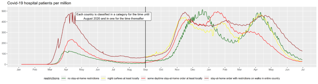
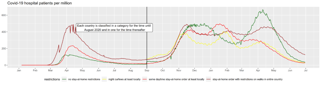
In the first graph, Poland is grouped in the curfew category for the second wave, in the second it is grouped in the “no restrictions” category. As hospitalization data is only available for 29 European countries, the effects are even more driven by few, mostly larger countries, in this case Poland.
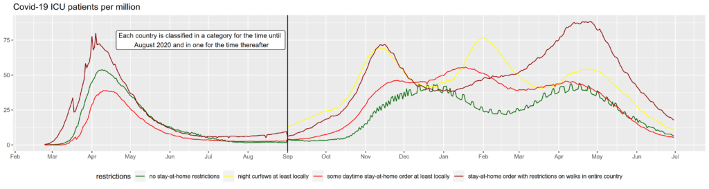
For ICU patients, I show only one plot as no data is available for Russia or Poland. Even though the data still includes Bulgaria and Serbia, which had no stay-at-home restrictions after the first wave and high hospitalization rates, the green line is rather low again.
Again, if anything these examples show that such plots cannot be interpreted to derive any policy conclusions. But the fact that there isn’t a clear visible effect of not restricting free movement throughout all these graphs lets me assume that other factors are far more important in determining the spread of the virus than the question whether a country imposed strict lockdowns or not. Another basic conclusion that can be seen in such graphs is that not locking down does not automatically lead to an exponential growth of cases until herd immunity is reached. Both conclusions do not rule out the possibility that strict lockdowns had some effect that just isn’t visible in simple cross-country comparisons because it is masked by other factors. I will come back with more complex analyses in the future.
Why is this plausible?
Before proceeding to the literature review let me quickly address why I think it is completely plausible that stay-at-home restrictions might have had no impact on preventing health systems from collapsing at all: One possibility is that even if we had just gone on normally with our lives, the virus would not have been dangerous enough to bring every health system to its knees. But it is impossible to tell which health systems could have coped with a “business as usual” approach for a simple reason: With or without state coercion, people all over the world changed their behaviour drastically. I think it is not unlikely that voluntary behavioural changes contributed more to “flattening the curve” than any government intervention. Human beings are not computer programmes that only respond to commands. Except for young children and seriously mentally handicapped people, we are capable of estimating risks and applying preventive measures to protect ourselves. The measures people take voluntarily might even be the most adequate ones as they are informed about their own risk profiles whereas policies mostly come with a “one size fits all” approach.
Another main reason why we don’t see a clear effect of stay-at-home restrictions is that almost all countries without such policies still imposed strict and unprecedented rules on events and gatherings. Theoretically, it seems far more likely that bans on gatherings have an effect on infections than restrictions to the individual right of movement have. There is no way of getting infected without coming close to someone infected (or touching something the infected person touched before but this is only a minor channel of transmission for SARS-CoV-2). If you prevent two healthy people to meet, this has no effect on infections. If you prevent someone, even if infected, to go for a walk on himself, this has no effect on infections. The only possible way of stay-at-home orders to reduce infections would be by preventing infected people to meet others. But even most countries that did not implement stay-at-home orders have introduced strict rules on gatherings and nearly all countries have mandated those who tested positive or showed symptoms to isolate. This is a plausible explanation why stay-at-home orders seem to have had no significant effect. As the author “zacki” explains here (in German), “Lockdowns nearly only affect loose contacts between non-infected. Therefore, they have little effect.”
Possibly, stay-at-home orders didn’t show a strong effect due to the exceptions under which it was allowed to leave the house. In most cases, it was always allowed to leave for work, often restricted to “essential” sectors which mostly included the entire primary and secondary sector. This led to bizarre scenarios: In nearly all countries, it was perfectly legal to stay in a badly ventilated room with many others as long as it was work-related. In most places, this was not only true for the most indispensable type of work. In large parts of the world, people could legally work together to produce, say, hiking equipment but if the same people would hike in the forest this would have been illegal despite a much lower risk of infection outdoors.
The scientific literature on lockdown effectiveness
So what does the science say? Do fancy statistical models come to different conclusions than straightforward visualisations? In the following, I will present some studies that analysed the effectiveness of lockdown measures. My literature review has not been systematic, but it includes the most frequently cited studies on the subject. If you know of another study that I should include here, feel welcome to reach out to me.
I’ve written the literature review below in July 2021, so any more recent publications are not included. I’d like to give a honourable mention to the recent working paper of Herby et al. (2022) though. The authors performed a meta-analysis of NPIs on Covid-19 mortality. They estimate that stay-at-home orders reduced Covid-19 mortality by 2.9 % on average. 13 studies were included in this calculation. Surprisingly, only one of these 13 is included in my literature review below, namely Chaudhry et al. (2020). That is mainly due to my regional focus on Europe. 9 of the other 13 studies Herby et al. used focussed exclusively on comparing different states or counties within the United States.
Another review of the literature published after my I first uploaded this website is Joffe and Redman (2021), which I will address in more detail in the section on cost-effectiveness of lockdowns.
Perhaps the most influential study on the effects of lockdown measures was published in Nature by Imperial College’s Flaxman et al.: “Estimating the effects of non-pharmaceutical interventions on COVID-19 in Europe”. Their paper has been cited in over 1000 other publications according to Google Scholar and it has been one of the main sources for politicians and journalists who have claimed that “lockdowns work”. The time frame they analysed was from February 2020 to 4 May 2020. Flaxman et al. write “We find that across 11 [European] countries 3.1 (2.8-3.5) million deaths have been averted owing to interventions since the beginning of the epidemic.”. This is the premature conclusion that made it to the news. It is premature or even misleading due to several serious flaws in their methodology:
In the words of the authors: “The counterfactual model without interventions is illustrative only, and reflects the assumptions of our model. We do not account for changes in behaviour; in reality, even in the absence of government interventions we would expect Rt to decrease and therefore would overestimate deaths in the no-intervention model.” Flaxman et al. worked with a model that only allows two things to change the reproduction number Rt: Policy measures and past infections, i.e. herd immunity. Except for correcting for herd immunity, they assume Rt to be constant and to only change every time a policy intervention comes into force. They assume “that changes in Rt are an immediate response to interventions rather than gradual changes in behaviour”. This is crucial. They completely neglect any voluntary changes in behaviour. As anyone who has lived through last year can tell, this is a completely unrealistic assumption. They also largely neglect other factors that caused infection dynamics such as seasonality. Their reasoning is somewhat circular: They made a model that only allows policy interventions to slow infections, matched it to data of falling infections and, surprise, found that policy interventions were the cause for the fall in infections.
As the authors state themselves, it is hard to disentangle the effects of different interventions given that they were implemented in rapid succession. According to their estimations, lockdowns have caused a significant reduction in Rt of 81% (95 percent confidence interval: 75% to 87%). Other measures, e. g. school closures, were not identified to have an effect on Rt. The exception is Sweden where despite not locking down, infections fell (even if slightly slower than in many other countries). As is shown by Soltesz et al. (2020), Flaxman et al.’s model is extremely sensitive to changes in NPI definitions. Soltesz et al. also show that Flaxman et al.’s model only works by assuming an unrealistically large country-specific effect that caused the pandemic to slow down in Sweden despite not having introduced a lockdown. This point was also raised by Philippe Lemoine in a blog article, so if you want some more technical reasoning why Flaxman et al.’s paper is bad science, please read there.
According to the supplementary information of their paper, Flaxman et al. define lockdowns like this: “As an overall definition, we consider regulations/legislations regarding strict face-to-face social interaction: including the banning of any non-essential public gatherings, closure of educational and public/cultural institutions, ordering people to stay home apart from exercise and essential tasks.” This is an extremely vague definition and results in 10 countries (all except Sweden) having locked down: Italy, Spain, Austria, France, Belgium, Denmark, Switzerland, Germany, Norway and the UK. How should they come to any conclusions about the effectiveness of a “lockdown” when they do not even decide what they mean by lockdown? Spain turned itself into an open prison for 2 to 3 months while in Denmark people were allowed to go out whenever they wanted and meet up with up to 9 other people at a time. This can hardly be treated as the same policy.
The initial R value they modelled the counterfactual model with was 3.8 on average, somewhat higher or lower in the different countries and they worked with early estimations of the infection fatality rate (IFR) of around 1.38%. The IFR is the proportion of deaths from infection compared to the total number of infected individuals, diagnosed or not. An R0 of 3.8 is somewhat higher than many more recent estimates but was probably fair to assume in the spring of 2020. An IFR of 1.38% is probably an overestimation, however. A meta-analysis by John Ioannidis published in the Bulletin of the WHO found a median IFR of 0.27%. Another meta-analysis by Meyerowitz-Katz and Merone found an estimated IFR of 0.68%. Due to an aged population, the IFR is likely to be significantly higher in Europe than on global average. A serological study on a super-spreading event in Gangelt, Germany by Streeck et al. (2020) published in Nature calculated an IFR of 0.36%, but according to Dimpfl et al. (2020) this figure needs to be corrected to 0.46% due to deaths reported after the end of the study period. Combining the Gangelt data with data from a serological study from another hotspot (Ischgl, Austria) and national data on tests and deaths in Germany, Dimpfl et al. calculate an IFR of 0.83% for Germany. Whatever the real IFR is, it is most likely far below 1.38%.
In conclusion, given the unrealistic assumption of no voluntary behavioural changes, the disregard of seasonality and other important factors, the vague definition of different policy interventions, the incapacity to explain the case of Sweden, and the extremely high IFR estimate, the paper of Flaxman et al. should not be taken as evidence for the effectivity of lockdown. Aside from these methodological flaws, their analysis only covers 11 countries for less than 3 months. Over one and a half years into the pandemic, we can draw on more comprehensive data.
In the same issue of Nature from 8 June 2020, another very influential paper on lockdown measures was published: Berkeley’s Hsiang et al.’s “The effect of large-scale anti-contagion policies on the COVID-19 pandemic” was cited over 600 times according to Google Scholar. The authors analysed regional data from six countries (Italy, France, China, South Korea, Iran and the United States) until 6 April 2020 and estimate that all policies combined reduced the average growth rate of infections by 25%. However, they also ignore behavioural adaptation in their analysis: “If individuals alter their behaviour in response to new information unrelated to anti-contagion policies, such as seeking out online resources, this could alter the growth rate of infections and thus affect our estimates. If increasing availability of information reduces infection growth rates, it would cause us to overstate the effectiveness of anti-contagion policies.”
They further find that when policies are assumed not to have an immediate effect on infections but recalculate their model in a way that a policy only becomes effective between one and fifteen days after it is introduced, the estimated effects of policies and the significance of these effects shrink. It is not just a fair assumption, but absolutely clear that any policy does not affect (diagnosed) infections the next day given an incubation period of about 5 days. The included policies were very heterogenous but included home isolation in China, Italy, Iran, France and the US. In France, the effect of home isolation was combined with business closures on the same day and was estimated to amount to a 15% decrease in per day growth while in Italy, home isolation was associated with a 3% rise in per day growth rate (though not significant).
So, just like the Imperial College team, the Berkeley scientists estimate their model based on the unrealistic assumptions that voluntary behavioural changes and seasonality do not influence infections and additionally they ignore the incubation period of SARS-CoV-2. Even if these serious flaws would have been addressed, the time frame they analysed was rather short and behavioural changes could very well differ between the first wave in March 2020 and current or future infection dynamics so that any effects found are unlikely to be repeatable in the present or future. But remember that effects of behavioural changes are discarded from the beginning, making the paper useless for deriving policy recommendations.
Islam et al. (2020) used the Oxford Covid-19 Government Response Tracker to estimate the impact of non-pharmaceutical interventions on infections in 149 countries or regions. For their lockdown variable, they combined stay-at-home regulations with restrictions of movement within a country. Following their approach, even Sweden had a lockdown. Out of 149 countries, only Belarus, Iceland and Tanzania did not impose a lockdown. It is not clear what lead to this coding, but I assume that they included countries with recommendations to stay home, which according to the Oxford data, included Sweden and other countries that did not impose mandatory stay-at-home orders. Islam et al. found that this “lockdown” together with school closures, workplace closures, restrictions on mass gathering and the closure of public transport had a joint effect of reducing the incidence of Covid-19 by 13%. As they do not work with a completely unrealistic counterfactual scenario and only use real-world data, this estimate could be more realistic than those presented in the above-mentioned papers. Their work does not give any estimate on the impact of lockdowns in particular though. If lockdowns combined with a set of other measures like school closures, business closures, or restrictions on gatherings, reduced the incidence by 13%, this figure could be interpreted as an upper boundary of the effect of lockdowns alone.
Haug et al. (2020) analysed the impact of NPIs in 79 countries in March and April of 2020 using data from the Complexity Science Hub Covid-19 Control Strategies List (CCCSL), the above-mentioned Coronanet Project and the WHO-PHSM dataset. They disaggregated several different NPIs and found small gathering cancellation to be the most effective one. National lockdowns (including stay-at-home orders in US states) and individual movement restrictions (lockdowns and curfews) both were among the most effective interventions with an estimated reduction in Rt of about 0.1. As with all other studies, it is difficult to clearly isolate the effect of lockdowns given that many other measures were taken simultaneously. As Haug et al. write, lockdowns can be seen as the “‘nuclear option’ of NPIs: highly effective but causing substantial collateral damages to society, the economy, trade and human rights”. They also stress that “communicating on the importance of social distancing has been only marginally less effective than imposing distancing measures by law.”
Brauner et al. (2021) published a paper in Science in 2021. They collected information on non-policy interventions between 22 January and 30 May 2020. In their study, Brauner et al. reestimated their model several times under different assumptions to arrive at an estimate of the effects of single NPIs which they categorised as having either a small (<17.5%) effect on Rt, a moderate one (between 17.5% and 35%) or a large one of more than 35% reduction of Rt. According to their study, school and university closures had a large effect as did bans on gatherings to 10 people or less. When other interventions were already in place, issuing a stay-at-home order was only associated with a small effect on Rt. As Brauner et al. write they “found that issuing a stay-at-home order had a small effect when a country had already closed educational institutions and nonessential businesses and had banned gatherings. In contrast, Flaxman et al. and Hsiang et al. included the effect of several NPIs in the effectiveness of their stay-at-home order (or “lockdown”) NPIs and accordingly found a large effect for this NPI.” Just as the other studies, Brauner et al.’s model does not account for voluntary behavioural changes.
Banholzer et al. (2020) analysed the infection dynamics in 20 countries through 15 April 2020. They find lockdowns to be the least effective among seven investigated NPIs. According to their estimations, lockdowns were responsible for a 5% decrease in reported cases while venue closures, border closures, work bans on non-essential activities and event bans all had a substantially larger effect of 23% to 36%. Banholzer et al. argue that “the moderate effect of lockdown may be explainable by event bans, venue closures and gathering bans catching already a substantial part of the impact of a lockdown”. Their analysis is subject to the same limitations as most other research nonetheless: Their model implicitly attributes all changes in cases to NPIs and neglects voluntary behavioural changes. Banholzer et al. did not assume NPIs to have an immediate effect on infections though, but assumed a 7-day delay which corresponds to a typical SARS-CoV-2 incubation period.
Liu et al. (2021) analyse the Oxford data for 130 countries for the time between 1 January and 22 June. With the same limitations in mind with regard to the reliability of this data and to the assumption that only NPIs affected behaviour, their results are interesting as they conflict with those of e.g. Flaxman et al. Stay-at-home requirements were not associated with a reduced reproduction of the virus. According to Liu et al., school closures and internal travel restrictions were the NPIs most strongly associated with a lower Rt.
Chaudhry et al. (2020) looked at the 50 countries with most cases (as of 1 April 2020) until 1 May 2020. They do not find lockdowns to have an effect on cases but they do find that lockdowns are positively associated with recovery rates. They cannot offer an explanation why lockdowns should affect recovery rates if they affect neither critical cases nor overall mortality. Instead, higher Covid-19 caseloads were associated with higher obesity prevalence, median population age, and longer time to border closures from the first reported case. Increased mortality was associated with higher obesity prevalence and GDP per capita.
Bjørnskov (2021) compares weekly mortality data in the first half of the years 2017, 2018, 2019 and 2020 in 24 European countries. Using general mortality data is independent of differences between countries in reporting behaviour. Also, general mortality is a much better figure to inform policy decisions as it is comparable across years. Counting only Covid-19-related deaths bears the danger of overreacting as there is no “normal” number of such deaths since SARS-CoV-2 is a newly emerged virus. But as those who die following an infection with the virus are usually old or sick, a significant proportion of them would have died anyway. Comparing general mortality means that we no longer compare against zero, but against the usual mortality that we have been used to and that we accept as a society. Bjørnskov accounts for the potential endogeneity of lockdown policies by including lags of mortality rates and uses two different specifications of the Oxford policy stringency index. In his paper, he finds no relationship between lockdown severity and mortality.
Koh et al. (2020) used the Oxford data and found that physical distancing measures were effective in containing the spread of the virus if applied early. Mandatory stay-at-home orders were not more effective than recommendations to stay home.
As stated before, the literature review at hand is not intended to be comprehensive and many more studies could be included here. Regarding the last point, I would like to quote a literature review performed by Allen (2021):
“There are, by my count, close to twenty studies that distinguish between voluntary and mandated lockdown effects. Although they vary in terms of data, locations, methods, and authors, all of them find that mandated lockdowns have only marginal effects and that voluntary changes in behavior explain large parts of the changes in cases, transmissions, and deaths.”
Loewenthal et al. (2020) claim to have found a clear correlation between the time at which a country entered lockdown and the mortality rate, but no such relation between lockdown strictness or lockdown duration and mortality rate. The authors define “lockdown” very differently from most other sources though, indeed I would argue that their wording is somewhat inaccurate. Loewenthal et al. (2020) do not look at explicit non-pharmaceutical interventions. They did not study laws and news articles. Instead, they used data on people’s movement for OECD countries collected from using maps on iPhones. They define the time at which a country went into lockdown as the time when actual mobility dropped. “Lockdown strictness” refers to how much mobility fell. This is certainly influenced by NPIs as Loewenthal et al. found the steepest fall in mobility in Spain (88%), which banned all non-essential movement with fewer exceptions than most other European countries. For my interpretation, Loewenthal et al.’s paper shows how little coercive lockdowns helped in containing the pandemic. Mobile phone data clearly shows that there has been a substantial reduction of people’s movement in all countries, independent of whether the country introduced a stay-at-home order or not. In Sweden, mobility dropped by 29%. Loewenthal et al.’s data suggest that the largely voluntary, but more moderate decrease in mobility in countries like Sweden were enough to yield the same benefits as the drastic decrease in countries like Spain. Loewenthal et al. further mention that the drop in people’s movement does not always coincide with the timing of government orders.
Several studies have shown that the peak of infections was reached before a strict contact ban was introduced in Germany, including a stay-at-home order in 6 of 16 states. People’s changed behaviour, possibly combined with earlier restrictions such as bans on large events, were sufficient in flattening or even bringing down the curve and keeping the reproduction number below one (see for example Wieland (2020) and Berlemann and Haustein (2021). For more evidence on this pattern for other countries, please refer to Philippe Lemoine’s “The case against lockdowns” I already advertised further above. A German source showing that the peak of infections was reached before lockdown in Germany, Austria and Ireland is Zacki (2021).
If there is such an unclear correlation between the strictness of containment measures and success in containing SARS-CoV-2, what is it that drives the huge differences between countries? I do not want to dig deep into this subject, but I would like to point to De Larochelambert et al. (2020) who used the Oxford data to investigate whether stricter or any lockdown rules were associated with lower Covid-19 death rates. What sets their paper apart from many of the aforementioned ones is that they looked at a broad range of other indices from five domains (demography, public health, economy, politics, environment) that could affect Covid-19 mortality. Lockdown strictness (though measured by the rather imprecise Oxford stringency index) was not associated with Covid-19 mortality but many other factors were: Obesity and inactive lifestyle, a higher mortality rate from cardiovascular diseases and cancer, GDP, a high or declining life expectancy, a lower mortality rate from infectious diseases and some geographical variables. My interpretation of these findings is that stay-at-home orders could even increase Covid-19 mortality in the medium run: If obesity and an inactive lifestyle are strongly associated with higher mortality, but lockdowns are not, how do you expect mortality to decrease when physical inactivity is enforced by locking people in their homes?
Many countries resorted to night-time curfews instead of all-day lockdowns during the second wave in winter and spring 2020/21. Without going too much into detail, I want to point to few studies analysing the effects of such curfews. Given the ambiguous effect of full-time stay-at-home orders, it seems very unlikely that part-time stay-at-home orders, i.e. curfews, have a huge effect. This is claimed by many governments nonetheless. When Germany introduced a national curfew (implemented locally depending on the local incidence), they used the work of Sharna et al. (2021) to prove the effectiveness of curfews (see the official justification). The authors collected data on NPI implementation, infections and deaths in 114 regions of 7 European countries between 1 August 2020 and 9 January 2021. Analyzing regions and not states takes account for the large subnational and even subprovincial variation in infections as well as in NPIs. Sharna et al. did not look at daytime stay-at-home orders, but one of the measures analysed were nighttime curfews. Sharna et al. estimate that night-time curfews had a moderate effect of reducing Rt by 12% but noted that curfews, due to their broad nature, interact with several other NPIs. The Closure of all non-essential businesses reduced Rt by 35% and a ban on all gathering reduced Rt by 26%. One of the main authors later criticised politicians for misinterpreting the study by concluding that nightly curfews would reduce Rt in Germany by 13%. He highlights the large uncertainty margins and the interconnectedness with other NFIs as well as the fact that the curfews were of very different duration.
Aside from Sharna et al., the German government cited two other studies in their official justification of night curfews: Domenico et al. (2021) estimated a model using data from the second wave in France estimating that curfews have brought down Rt by 15%. The authors acknowledge that it is difficult to single out the effect of curfews as they came together with other social distancing policies. The third study, Ghasemi et al. (2021), uses Canadian data to show that curfews were successful in reducing nighttime mobility, but did not address the epidemiological effects i.e. whether these contacts have led to infections.
In my eyes, the German government could have had a closer look at another study that provides empirical evidence on the effects of curfews in the German state of Hesse: De Haas et al. (2021) study the effects of night-time curfews from 9 PM to 5 AM in Hesse. The period of analysis was 18 November 2020 until 28 February 2021. Of the 26 counties in Hesse, 15 imposed a night curfew for some time during the observation period. Unlike studies that compare countries with very different demographic, economic or cultural characteristics, De Haas et al. worked with a quite homogenous sample. Their quasi-experimental study found no effect of night curfews on infections.
So, to shortly summarise the existing evidence on the effects of lockdown measures on the pandemic itself, we can certainly repeat the standard sentence in conclusions of scientific papers: More research has to be done. Existing evidence gives different results: Some studies find stay-at-home orders to be effective (though not necessarily efficient) in “flattening the curve” (e.g. Flaxman et al., Hsiang et al., Haug et al.) while others do not find lockdowns to significantly contribute to curbing the spread of SARS-CoV-2 (e.g. Brauner et al., Banholzer et al., Liu et al., Chaudhry et al., Bjørnskov). All studies face difficulties in attributing the dynamics of the coronavirus spread to certain measures given that many measures were implemented simultaneously, given that people adapted their behaviour voluntarily and given the many other factors that determine the path different countries take in the pandemic, e.g. seasonality and demography. Evidence for other NPIs is similarly unclear: Some studies find school closures to be highly effective for example (Brauner et al., Liu et al.) while others find them to have only a very small effect if any at all (Flaxman et al., Banholzer et al.). There seems to be no evidence that stricter lockdown rules are any more effective in fighting the pandemic given that several studies find voluntary social distancing to be equally effective as enforced confinement (Loewenthal et al, Koh et al., Islam et al.). Evidence from several countries points to the fact that people voluntarily reduced their movements (and probably their contacts) before any stay-at-home orders were introduced (e.g. Wieland, Berlemann and Haustein, Lemoine). As with full-time stay-at-home orders, the effects of curfews are disputed with some studies suggesting that they had a moderate effect on reducing infections (Sharna et al., Domenico et al.) and others not finding any effect (De Haas et al.).
The much-repeated claim that stay-at-home orders were necessary to prevent an unstopped exponential growth in infections with unavoidably overloaded hospitals can easily be discarded by looking at infection dynamics in the many places that did not confine their residents. Despite popular belief, Sweden is not a huge exception in this regard, but is in the same team as other Nordic countries (Denmark, Finland, Iceland and Norway), Switzerland, Croatia (despite strict internal movement restrictions), Estonia, Serbia, Poland, Bulgaria (the four latter only during the second wave) and many other countries around the world. Evidence from the United States does not show a clear difference in infection trajectories between those states that locked their citizens in their houses and those that did not. If stay-at-home orders have had any effects on infection dynamics, they are by far not as substantial as many people believe. Lastly, there seems to be little difference in effects between countries with extremely strict lockdowns like Spain during the first wave and those with lockdowns that still allowed going for a walk (e.g. Germany during the first wave). In the next section, I will address the other side of the coin, i.e. the undesired side effects of stay-at-home orders.
In conclusion, it is not clear whether strict lockdowns were effective in reducing the spread of SARS-CoV-2. Simple comparisons show no notable difference between countries that imposed stay-at-home restrictions and countries that did not. While it is possible that they affected the course of the pandemic, other factors seem to be much more important in explaining differences between countries or regions. The initial goal of “flattening the curve” was reached everywhere, with tough restrictions or without. The scientific literature about the effects of lockdowns is inconclusive and suffers methodological difficulties. Different studies come to completely different results. Many studies finding lockdowns to be effective use rather broad definitions of lockdowns and thus cannot be used to justify the strictest types of such policies.